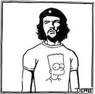
I saw this shirt on SportsCenter on snapchat and was really confused by it. It’s obviously intended to look like a child drew it, but it’s a genuinely marketed shirt known as the “Mens After School Special” shirt. I personally wouldn’t wear something like that and especially not to be broadcasted to hundreds of thousands of people but I was wondering what your thoughts were.
after seeing the post about how font matters I could not help but think of the lets eat grandma punctuation poster i grew up with and thought it would be a funny typography related anecdote!
as i begin to study for my finals and have been doing a lot of collaborative works with my classmates most of which have different font preferences. I personally like my papers and study guide to be in times new roman 12pt font and my exams to be the same. I find though that when I am not the person to start the study guide or group paper that it is awkward to change the font but most times they do it in arial and i hate it. am i the only one who has a preference?
As the holidays are approaching and I am seeing holiday stuff in stores everywhere, I’ve been thinking about the rhetoric of Christmas and holidays in general. I think Christmas, in particular, is an incredibly visually-driven holiday, especially when you consider the red and green, decorations, gifts, Santa/elves, family cards, etc. The idea of spreading joy and cheer through visual images seems simple, but it’s done in so many varied ways. I guess I don’t have a specific question, but I’d be curious to see if anybody has any thoughts on holiday or Christmas advertising/rhetoric, because it’s so present and saturated this time of year.
My friend was wearing this shirt. When I saw the logo my first question was does the dragon symbolize the cancer that the kid is defeating? This seems like a question with a simple answer, but I feel like this logo is either a little lazy or incredibly deep. Could they not have come up with a design that brings the cop aspect into it more deeply than the shape of the logo? Maybe I’m thinking too deeply, but thoughts?
These are the different coloured passports I mentioned in class. Vietnam and India are the weaker ones and the UK, Chile and Italy are the strongest. There are many similarities between these strong passports including the symbol at the bottom although I’m not sure what it stands for. The insides of these passports are also way more intricate than the weaker ones.
In my New Media class, we read and talk a lot about how the concept of ‘updating to remain the same’, which refers to how technology needs to be updated in order to keep them relevant and important to society. I was thinking of this when reading about how Craigslist has kept the same interface and look since its inception. I wonder if Craigslist would be used more or less, or considered more or less significant, if it had been updated visually or ergonomically. I think there is a certain charm or nostalgia to the visual aesthetics of a service that has stayed the same for so long.
With Winter break coming up I’ve been planning my trip back home and have been looking at public transport options for getting to the airport. I really hate the public transport in NYC but I love the one in Boston. Over the summer when I was in Boston I looked at the map in the station rather than my phone pretty often as there wouldn’t be good phone connection in some areas. I found the map of the MBTA really easy to read and it didn’t take me too long to figure out what routes I needed to take. Does anyone feel the same way about the MTA? Because visually the map feels a lot harder for me to understand but that could also be because of the layout of the city and the location of the stations.
I’ve been playing a lot of video games recently and have noticed how different the maps between each game are. Different games have different approaches to maps based on the type of game they are and how useful a visual map is to the player. In more open world games like Hogwarts Legacy or Read Dead Redemption 2, the map is integral to the completion of quests and there are many that are location based. These maps will have markers for location and also points of interest. In games like Overwatch 2, seeing an actual map is not as useful as enemies come from all places and there are other ways the game shows direction like highlighted points or arrows.
I saw this poster in the same restaurant as the bathroom posters so I wasn’t very surprised there were stranger posters outside as well. This poster is just so hard to read and there are just too many fonts used in this poster. The overlap of text and image also make it hard to read.
I went to NYC over Thanksgiving and saw these posters in the bathroom. I thought this was a weird place to put them but I guess people might read them more often if they’re in there. They’re pretty typical of these types of posters but the mix of fonts in these ones really don’t work for me. What do you guys think? Would they have been received better in another setting?
Since it is all over social media feeds right now, I’ve been seeing Taylor Swift’s TIME person of the year cover all morning. I wanted to see what others think about the visual rhetoric of this cover and what we can pull from it. What does it want us to feel or think about Taylor Swift? I definitely think there is an intentional sense of power and maybe glam involved in some ways, but I think the cat was an unexpected choice. For comparison, I’ve included the person of the year cover from 2022, which featured President Zelensky and the Spirit of Ukraine. I’d love to hear your insights on maybe how each cover acts to represent each person of the year differently or if you have a favorite/any other thoughts.
I know it was a while ago that we spoke about advertisements but as it gets closer to the new year I cant help but think about superbowl adds and LOVE this website to look at old ones. Anyone have a favorite they can remember?
I found the article about the interview with Craig of Craiglist to be really interesting as he called things that are simple and functional beautiful- like his website. This made me think of how people get so obsessed and focused on the aesthetics of things, but then made me wonder if aesthetics take away from effectiveness. I feel like there are cases where this can occur but also cases where aesthetics can also be persuasive and add to the effectiveness of a piece of visual rhetoric. What are your thoughts? Do you think simplicity or something aesthetically pleasing is more effective? Or can something be simple and aesthetically pleasing (though I don’t think Craigslist falls under that category)?
So, what’s your top song for 2023? Or, if you’re embarrassed to share it, what’s a song I should listen to that came out in the last year or two? (As I said in class, I look forward to Wrapped every year so that I can find some new music/bands.)
I don’t use Spotify, but my most-listened-to song on my phone for 2023 is Tcheezy’s “Zuzu.” It came out two or three years ago, though.
I did not sleep last night thinking about this nightmare of a section of the Beach Plum menu in class. This horrifying presentation of crustacean creations will truly haunt me for months to come. I’ve seen many a lobster shack, this is one of the few times I have ever seen someone use ounces to depict how much lobster is in a roll – the standard is usually .25 pounds. Yes, equivalent to 4 oz, but they are using the smaller units to make it seem like “its a lot of lobster.” But let’s consider for a moment piling 10 oz of lobster in the small hot dog bun, as pictured above. The picture is already showing far more than 4 oz, but thats just a lot of food, some bang for your buck. What is really throwing me off are the fixed prices. The most famous Lobster Shack in the country, Red’s Eats, and its far superior neighbor across the street, Sprague’s Lobster, both operate based on market price and usually remain around $22-$24 a roll – a very premium price for their product. That was until recently, as the Lobster Population in New England has been on a steady decline due to over fishing and the increased temperature of the oceans resulting in migration North and… well… lunch. This past season Red’s and Sprague’s both increased to above $32 for that quarter pound of lobster meat, again 4 oz. But let’s also consider, the Lobster Rolls and sea food generally are all those locations do. They are New England Sea Food Destinations. Their standard price is $22, and this Beach Plum has such a expansive menu, and after the way we’ve discussed it in class, seems to be a more kitschy, lowest common denominator draw trying to take advantage of the fame and prominence of their neighbors to the North. But somehow, their prices remain fixed. How are their prices remaining fixed? Even the McLobster (which was a real thing, I don’t recommend it) didn’t operate using a fixed price. I can’t imagine that they aren’t trying to make significant profit because the Lobster Roll is a staple of New England, the most prominent and heavy handed product advertised on the menu, and clearly what the restaurant is pushing the consumers to buy. Something about this seems so fishy (ha) and it scares me to my core. I fear that they’re just selling 0.625 pounds of food poisoning on a hot dog bun.
Unrelated, I think “Big Catch” is strategically placed underneath the Lobster Roll to imply that its a great deal.
Returned back to school after break to find this new apartment decor. Thought I would share and see everyones thoughts after looking at other Colgate maps.
As I’ve been driving around my city over break, I’ve noticed billboards and their rhetoric more than ever. I wanted to pose the question to you guys: what makes a billboard effective for you? Do flashy billboards with heavy imagery grab your attention (i.e. Times Square) or would a simpler, text-based one catch your eye? I’ve noticed that I personally am more inclined to notice and spend time looking at a billboard when there is more text because I wonder why a company would pay for that advertising space just to have people read those specific words. It reminds me of the movie, Three Billboards Outside Ebbing Missouri, in which a mother puts up three roadside billboards to call the police to action in solving her daughter’s murder. I’m not sure which I prefer because I think text-based ones can land their message better when they are done right, but I find images generally more interesting to look at. I’m curious to see what you guys think is more effective or if you have a preference.
On the day we talked about the periodic table in class, people questioned why the most good boy in the known universe was all the way to the left with Superman and Supergirl. I present to you now the answer from Superman himself:
Alright so I’m just obsessive and I feel rightfully upset. I was curious to see if the hiking or biking maps for Blue Sky Basin were any better or addressed some of the issues I had with their Ski map. I cannot express to you how disappointed and also mildly terrified I am at what is being offered by Vail. The two maps on the right are the hiking and biking maps for Vail, for me it still fails to actually tell me what features I will be encountering on the terrain and how to navigate those trails. Clearly it’s designed more as an advertising tool to generate interest rather than be used as a map. The map on the far left is of Mt. Katahdin in Baxter State Park in Maine. Katahdin is primarily famous for its hiking/backpacking as it is the Northern End to the American Appalachian Trail, however, (according to my friend who takes skiing much more seriously than I) it has a bit of a reputation among skiers as being pretty good but wicked treacherous. The map provided by Baxter is much more stripped down and is designed to show some of the topographical features of the mountain though it is less clear about the amenities of the area. Clearly designed with a different purpose. I’m not suggesting Vail should transform their maps into this no frills version which could be a bit more standoffish or less approachable to an average consumer, but incorporating some of the features present in the map of Katahdin may be beneficial and improve mens understanding of the terrain they’d encounter on their trip… or just make me less annoyed. That’s a good goal to have sometimes I believe.
I wanted to look at a map of a mountain that I often go to in Banff, and just realized that there is not actually a legend or a title for the resort. This is shocking considering this mountain is usually where people go for family vacations or take little kids to learn how to ski, yet the map of the mountain makes it seem like you would have to be an expert at skiing to understand the map and the colours.
recently this year by grandfather gave me his car to bring to school and in it he left a map of New York with a sticky note that said “for emergencies.” I brought this up to my housemates yesterday after watching the videos and making my own map and we all talked about how if we genuinely all lost cell service, none of us could be able to read the map he gifted me and find our way here or home. I think it is kind of sad that we have switched to such an electronic dependency but I am really curious to know if anyone feels confident that they could make it here or home electronic free just using a map?
Until watching “all Maps are wrong”, I didn’t realize that there is no correct map in this entire world. It is impossible. In this video they say that maps design has moved away from navigational purposes, and more for aesthetic and design. Is this because people gave up on trying to make the “perfect” map, or because in our generation no one uses maps anymore?
I was interested in the debate going on about the GPS navigating apps. I found this chart that shows exactly what each app has to offer. I agreed with @certifiedlova when they said they have just always used Apple Maps because it gets the job done and gets me where I need to go. However, I didn’t know that Waze offered police notifications, which is handy and makes me want to try it. Is this picture accurate? How many people have tried both Waze and Apple Maps?
I also read that Waze has recently added an emoji feature…
“With an ear to the Waze community, the company invested in new ways for users to communicate within the app, including new Moods. The emoji-like icons, which previously acted as a sort of personification of the driver, now make it easy to reflect how you feel on the road. frustrated by congestion? Rocking out to your favorite jams? Rushing to the office? Show the world with a Mood for every moment”
Has anyone used this? How does it work? Do you have to change your emoji while driving?
For those who might not be aware, Paul McCartney and Ringo Starr (He’s my favorite, fight me) released “the final Beatles song” Now and Then recorded using a combination of demos recordings of John Lennon’s vocals from the 70s and George Harrison’s guitar backings from 1993. I liked the song, I liked the video, I liked the mini doc about how they made it. I don’t love the cover art (The top image). The Beatles, Paul McCartney (and the Wings), and Ringo Starr have always had some kind of weird, intricate, artistic element to their album art that they seem to have just decided to forgo for this song. Its nice Italic text, very clear, the background is cool looking I guess, and if you want to argue that it is a bit more reminiscent of George and John’s solo albums’ art, fine. I concede. But they already had a significantly better piece of artwork that they just decided not to use.
The cassette tape (Bottom Image) is being used as the artwork for the Mini Documentary, press releases, and in so many other places rather than the actual album art. I think it’s more vivid, more personal, and is kind of the answer to the question of “wait, a new Beatles Song? how?” Sure it’s a little hard to read, but its also (supposedly) John’s actual handwriting. It’s still simple and retro, and it tells more of a story than just the words “Now and Then” on a patterned gradient blue background with strange folds and shadows that doesn’t seem to mean anything. I have a bunch of vinyls, my mom has all the Beatles albums on vinyl, assuming I’ll eventually get this, I’d much rather it be the cassette tape on the cover than just the words.